비지도 학습 중 유사한 속성을 가진 데이터끼리 군집을 만들어주는 클러스터링(군집분석)을 학습해 보겠습니다.
sklearn에서 제공하는 iris(붓꽃) 데이터를 활용하겠습니다. 분류형 모델에서 많이 사용됩니다~
1. 데이터 불러오기
# 필요한 패키지 설치
import pandas as pd
import numpy as np

# iris 데이터 불러오기 위한 datasets 설치
from sklearn import datasets
2. 분석에 사용할 학습용 데이터 만들기
# skearn.datasets에 포함된 iris(붓꽃) 데이터 가져오기
iris = datasets.load_iris()

# iris 데이터 내 data값들
data= pd.DataFrame(iris.data) ; data

# iris데이터의 feature 이름
feature= pd.DataFrame(iris.feature_names) ; feature

# data의 컬럼명을 feature이름으로 수정하기
data.columns = feature[0]

# 세가지 붓꽃의 종류
target=pd.DataFrame(iris.target) ; target

# 컬럼명 바꾸기
target.columns=['target']

# data와 target 데이터프레임을 합치기 (axis=1, columns으로 합치기)
df= pd.concat([data,target], axis=1)

df.head()
3. 데이터 구조 확인(컬럼 타입과 결측치 등)
df.info()
#target 컬럼을 object 타입으로 변경
df = df.astype({'target': 'object'})
# 결측치 없음, 각 속성마다 150개 row씩 있음
df.describe()
# 클러스터 돌리기 전 변수를 생성
df_f = df.copy()
4. 시각화 하기
import seaborn as sns
from matplotlib import pyplot as plt
from mpl_toolkits.mplot3d import Axes3D
from mpl_toolkits.mplot3d import proj3d
sns.pairplot(df_f, hue="target")
plt.show()
위 그림 3열에 petal length를 가지고도 어느정도 분류가 가능하겠네요.
그래도 4개 속성을 모두 가지고 클러스터링을 해보겠습니다.
원하는 속성을 사용해서 2차원, 3차원 그래프도 자세하게 그려보겠습니다.
# 2차원 그리기

fig = plt.figure(figsize=(5,5))
X = df_f

plt.plot(  X.iloc[:,0]
         , X.iloc[:,3]
         , 'o'
         , markersize=2
         , color='green'
         , alpha=0.5
         , label='class1'
        )

plt.xlabel('x_values')
plt.ylabel('y_values')

plt.legend() #범례표시
plt.show()
# 3차원 그리기

fig = plt.figure(figsize=(8, 8))
ax = fig.add_subplot(111, projection='3d')

X = df_f

# 3d scatterplot 그리기
ax.scatter(  X.iloc[:,0]
           , X.iloc[:,1]
           , X.iloc[:,2]
#           , c=X.index #마커컬러
           , s=10 #사이즈
           , cmap="orange" #컬러맵
           , alpha=1 #투명도
           , label='class1' #범례
          )

plt.legend() #범례표시
plt.show()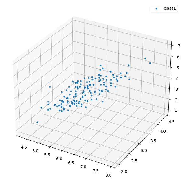
5. K-Means cluster
from sklearn.cluster import KMeans# 적절한 군집수 찾기
# Inertia(군집 내 거리제곱합의 합) value (적정 군집수)
ks = range(1,10)
inertias = []
for k in ks:
model = KMeans(n_clusters=k)
model.fit(df_f)
inertias.append(model.inertia_)
# Plot ks vs inertias
plt.figure(figsize=(4, 4))
plt.plot(ks, inertias, '-o')
plt.xlabel('number of clusters, k')
plt.ylabel('inertia')
plt.xticks(ks)
plt.show()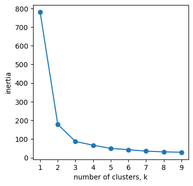
k개수가 3에서 완만하게 변하기 때문에 군집을 3개로 하면 적당할 것 같습니다.
# K-Means 모델과 군집 예측값을 생성

# 클러스터 모델 생성 파라미터는 원할 경우 추가
clust_model = KMeans(n_clusters = 3 # 클러스터 갯수
#                      , n_init=10 # initial centroid를 몇번 샘플링한건지, 데이터가 많으면 많이 돌릴수록안정화된 결과가 나옴
#                      , max_iter=500 # KMeans를 몇번 반복 수행할건지, K가 큰 경우 1000정도로 높여준다
#                      , random_state = 42
#                      , algorithm='auto'
                    )

# 생성한 모델로 데이터를 학습시킴
clust_model.fit(df_f) # unsupervised learning

# 결과 값을 변수에 저장
centers = clust_model.cluster_centers_ # 각 군집의 중심점
pred = clust_model.predict(df_f) # 각 예측군집

print(pd.DataFrame(centers))
print(pred[:10])
[1 1 1 1 1 1 1 1 1 1]
# 원래 데이터에 예측된 군집 붙이기
clust_df = df_f.copy()
clust_df['clust'] = pred
clust_df.head()
여기서 target의 번호와 clust의 번호가 다른것은 군집이 잘못나온게 아니라 넘버링된 번호가 다를 뿐입니다.
스케일링 한 후에 아래에서 잘 묶여 나왔는지 확인하겠습니다.
6. 군집분석 결과를 가지고 시각화 하기
# scaling하지 않은 데이터를 학습하고 시각화하기

plt.figure(figsize=(20, 6))

X = clust_df

plt.subplot(131)
sns.scatterplot(x=X.iloc[:,0], y=X.iloc[:,1], data=df_f, hue=clust_model.labels_, palette='coolwarm')
plt.scatter(centers[:,0], centers[:,1], c='black', alpha=0.8, s=150)

plt.subplot(132)
sns.scatterplot(x=X.iloc[:,0], y=X.iloc[:,2], data=df_f, hue=clust_model.labels_, palette='coolwarm')
plt.scatter(centers[:,0], centers[:,2], c='black', alpha=0.8, s=150)

plt.subplot(133)
sns.scatterplot(x=X.iloc[:,0], y=X.iloc[:,3], data=df_f, hue=clust_model.labels_, palette='coolwarm')
plt.scatter(centers[:,0], centers[:,3], c='black', alpha=0.8, s=150)

plt.show()
스케일링을 하지 않아도 3가지로 잘 분류된 것 같습니다.
# 3차원으로 시각화하기

fig = plt.figure(figsize=(8, 8))
ax = fig.add_subplot(111, projection='3d')

X = clust_df

# 데이터 scatterplot
ax.scatter(  X.iloc[:,0]
           , X.iloc[:,1]
           , X.iloc[:,2]
           , c = X.clust
           , s = 10
           , cmap = "rainbow"
           , alpha = 1
          )

# centroid scatterplot
ax.scatter(centers[:,0],centers[:,1],centers[:,2] ,c='black', s=200, marker='*')


plt.show()
7. 군집 별 특징 확인하기
cluster_mean= clust_df.groupby('clust').mean()
cluster_mean
8. 스케일링 하고 다시 군집분석하기
기존 데이터 값이 각 변수 별 값의 편차가 적어서 스케일링을 하지 않고도 아주 잘 군집이 되었지만,
일반적으로는 변수 별로 편차가 크기 때문에 스케일링이 필요할 수 있습니다.
*스케일링(표준화): 데이터 피처(속성)들을 평균이 0이고 분산이 1인 가우시안 정규 분포를 가진 값으로 변환해주는 것
from sklearn.pipeline import make_pipeline
from sklearn.preprocessing import StandardScaler

standard_scaler = StandardScaler()
scaled_df = pd.DataFrame(standard_scaler.fit_transform(df_f.iloc[:,0:4]), columns=df_f.iloc[:,0:4].columns) # scaled된 데이터
# create model and prediction
# clust_model은 스케일링 전 fit과 동일하게 맞춤

clust_model.fit(scaled_df) # unsupervised learning #애초에 결과를 모르기 때문에 data만 넣어주면 됨

centers_s = clust_model.cluster_centers_
pred_s = clust_model.predict(scaled_df)
# 스케일링 전에 합쳐준 데이터프레임에 스케일한 군집 컬럼 추가하기
clust_df['clust_s'] = pred_s
clust_df
# scaling 완료한 데이터를 학습하고 시각화하기

plt.figure(figsize=(20, 6))

X = scaled_df

plt.subplot(131)
sns.scatterplot(x=X.iloc[:,0], y=X.iloc[:,1], data=scaled_df, hue=clust_model.labels_, palette='coolwarm')
plt.scatter(centers_s[:,0], centers_s[:,1], c='black', alpha=0.8, s=150)

plt.subplot(132)
sns.scatterplot(x=X.iloc[:,0], y=X.iloc[:,2], data=scaled_df, hue=clust_model.labels_, palette='coolwarm')
plt.scatter(centers_s[:,0], centers_s[:,2], c='black', alpha=0.8, s=150)

plt.subplot(133)
sns.scatterplot(x=X.iloc[:,0], y=X.iloc[:,3], data=scaled_df, hue=clust_model.labels_, palette='coolwarm')
plt.scatter(centers_s[:,0], centers_s[:,3], c='black', alpha=0.8, s=150)

plt.show()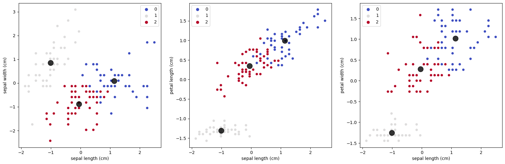
스케일링 한 데이터도 잘 시각적으로는 잘 나눠진 듯 합니다.
아래에서 자세한 비교를 해보겠습니다.
9. 스케일링 한 데이터와 안한 데이터의 군집 성능 비교하기
# 스케일링 전 데이터의 군집
pd.crosstab(clust_df['target'],clust_df['clust'])

# 스케일링 후 데이터의 군집
pd.crosstab(clust_df['target'],clust_df['clust_s'])

스케일하지 않았던 clust컬럼 데이터가 훨씬 정확하게 나왔습니다.
'Python 기초 배우기 > 파이썬을 활용한 분석' 카테고리의 다른 글
| [Python] List_Comprehension 리스트 안에서 for문, if문 사용하기 (0) | 2021.05.25 |
|---|---|
| [Jupyter 주피터] 주요 단축키 모음 (1) | 2021.03.03 |
| [Jupyter 주피터] 파이썬 에디터 설치하기 (0) | 2020.06.03 |
| [Repl.it 리플잇] 파이썬 에디터 설치하기 (0) | 2020.06.02 |


